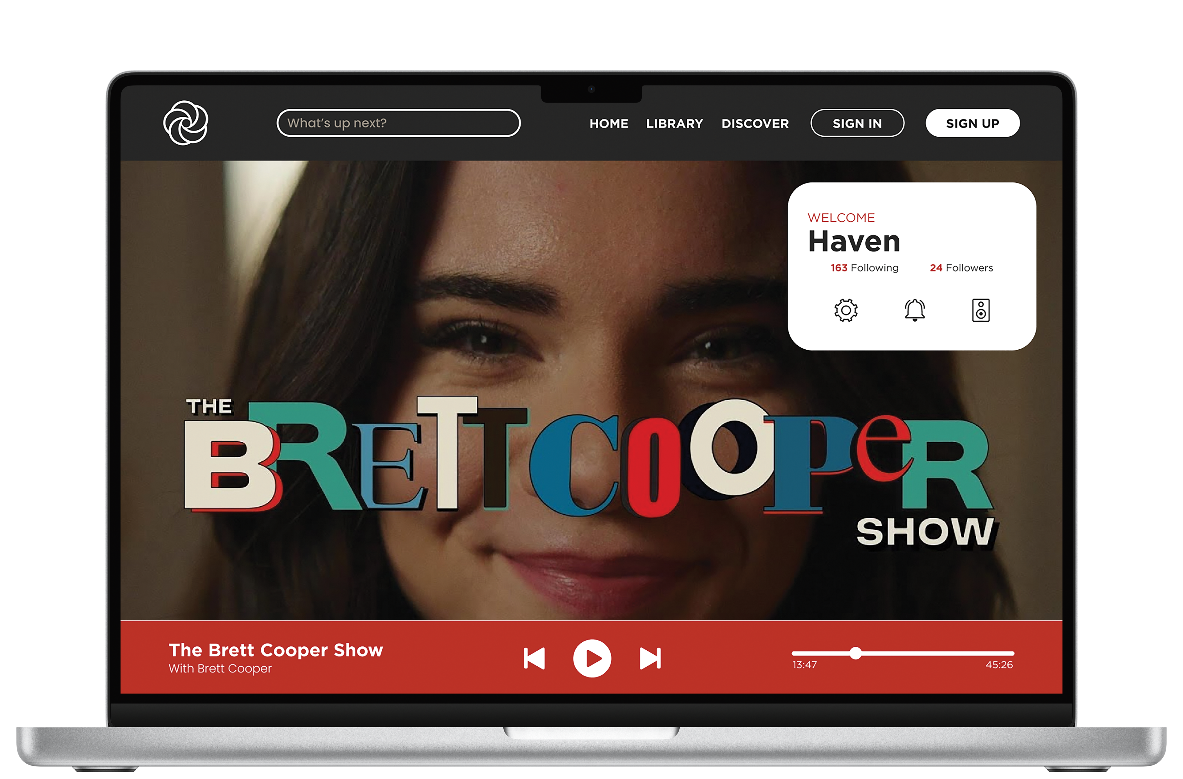
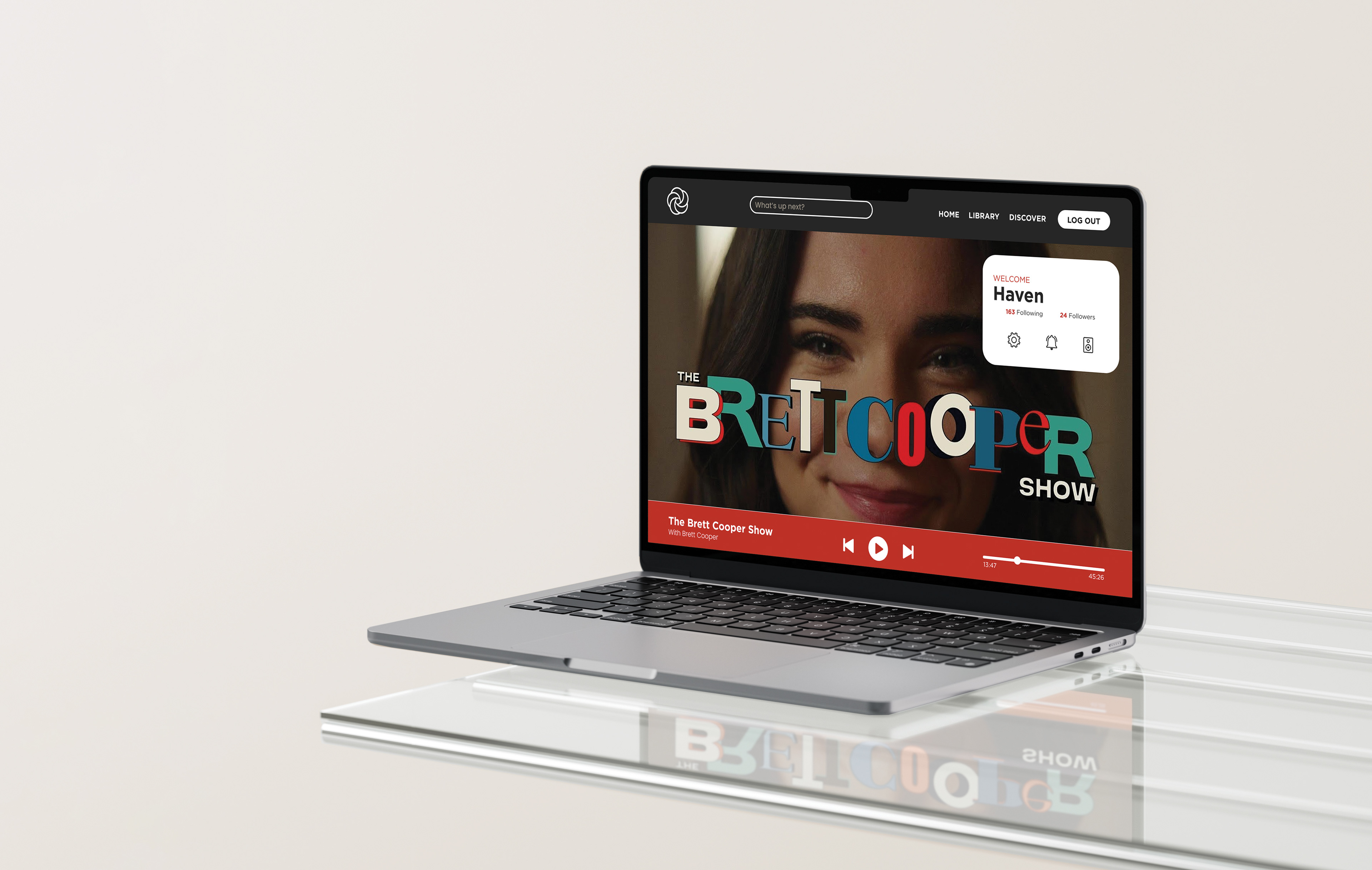
This podcast desktop application was a personal project I took on to sharpen my web design skills and challenge myself with a full UI/UX process from start to finish. The goal was to design a clean, intuitive platform for podcast listeners that balances functionality with modern, user-friendly aesthetics.
Rather than using typical earthy tones often associated with audio or lifestyle apps, I chose a color palette of red, gray, and tan to create a more energetic and sophisticated feel. The red brings a pop of vibrancy and urgency, while the gray and tan tones ground the interface with warmth and balance—offering a sleek, inviting experience for daily use.
Throughout the project, I developed multiple user flows to map out key interactions, sketched thumbnails to explore layout ideas, and created detailed digital wireframes to refine the structure. I also completed several rounds of visual comps, focusing on layout hierarchy, accessibility, and consistency. This project gave me the chance to deepen my understanding of design systems and user-centered thinking while creating something I’m genuinely proud of.


Wireframe

Earthy Variations

Dark Variations